Well: "Illustration Basics from Highlights" . Illustrator material from scratch from a well-known company! Suitable for beginners. The reviews are only positive, sometimes even chic! The material receives the exclusive material tag! The material can be quickly deleted, we recommend saving/downloading immediately. Sent the material Webwith comment:
Hi all! Material on learning to be an illustrator FROM ZERO. The authors are professionals in their field and have collected many excellent reviews over several years. The course is very detailed and is suitable for all categories of people and any level of training. This work pays quite well. I advise you to study and apply the skills in practice. Don’t forget about practice; practice before offering services. Good luck to everyone and have a good end to the summer!
Material may be removed at the request of the copyright holder!
Course Description:
We teach you how to create professional vector graphics, logos, icons, illustrations from scratch, even if you have never drawn before.
Advantages:
- The course lasts 4 weeks and consists of 8 lessons of 2 hours each.
- Great amount useful material and bonuses throughout your training.
- You will not only learn the basics of the Adobe illustrator program, the basics of illustration, but also build your portfolio, which will allow you to take commercial orders immediately after completing the courses!
Course program:
LESSON No. 1. INTRODUCTION TO THE PROGRAM:
- Differences between Adobe illustrator and other vector editors.
- Introduction to the concept of vector (raster and vector).
- Creating a document. Document settings.
- Setting up the program (dimension, interface).
- Getting to know the interface.
- Construction with a pen, Bezier technique.
- Vector curve nodes.
DZ: Creating a complex vector object.
LESSON No. 2. VECTOR AND ITS PROPERTIES:
- Interaction of several objects.
- Working with layers.
- Grouping. Ungrouping.
- Insulation. Insulation levels.
- Color and stroke.
- Working with gradients and gradient meshes.
DZ: Character Creation
LESSON No. 3. MANIPULATIONS WITH OBJECTS:
- Construction of curves.
- In-depth work with nodes.
- Combining objects. Types, methods.
- Operations with objects.
- Creating patterns.
- Shape builder.
DZ: Creation of a vector graphics complex.
LESSON No. 4. WORKING WITH TEXT:
- Types of text.
- Basics of typography - leading, kerning, tracking.
- Methods for creating fonts.
- Creation of a poster. Dive into printing
- Triangulation.
DZ: Rendering a font in several ways. Creating a poster
LESSON No. 5. EFFECTS FOR VECTOR. RASTER GRAPHICS:
- Effects that change the visualization of vector objects.
- Managing the effects of vector objects.
- Types of object transparency.
- Combining a vector with a raster.
- Trace.
- Screening.
- Mask of vector objects.
DZ: Combination of vector, raster and text. Applying effects.
LESSON No. 6. ADDITIONAL TECHNIQUES AND TOOLS. PART 1:
- New illustrator - features of 2018.
- Glitch, long shadows and other graphic techniques.
- Working with a tablet.
- Drawing. Creating a Brush
DZ:
LESSON No. 7. ADDITIONAL TECHNIQUES AND TOOLS. PART 2:
- Puppet deformation.
- Perspective grid.
- Parsing and rendering different types illustrations.
- Creating a stamp on the media.
DZ: Use one of the techniques for creating graphics from the lesson, and apply it in your project or on a free topic.
LESSON No. 8. AUTOMATION OF THE PROCESS. SAVING THE PROJECT. ADVIСE:
- Color settings and color schemes.
- Scripts and plugins.
- Integration with other programs. File preparation, saving and export.
- Labor market and advice
FINAL TASK: Creation of a logo, icon and a whole menu based on the selected theme.
The download link for this material is available only to registered users of the site. Registration on the site is free and will not take much time. If you already have an account, you can log in.
The material is provided for informational purposes only!
My Virtual School has been conducting courses and trainings on working in Adobe Illustrator . Back in 2012, I recorded a short video course “Adobe Illustrator in One, Two, Three,” which I still distribute for free to my subscribers.
Then, in 2014, together with my team, I launched an online training on creating vector illustrations for microstocks. The training turned out to be very popular and successful - we recruited groups of 50-70 people 4 times.
During the course, many of our students were able to not only create high-quality portfolios - they actually started making money on microstocks!
Several works of training participants
To view the entire image, click on its thumbnail


Alumni of our Adobe Illustrator training often asked me if I was planning to prepare a new training for advanced illustrators.
The question is quite logical, because in vector illustration, as in design, there is no limit to perfection!
Having learned to draw simple icons, ornaments and textures that are starting to be sold on microstocks, a person gets a taste for it. Drawing vector illustrations becomes not only a hobby for him, but also a constantly growing income. Of course, everyone wants to earn as much as possible, and for this you need to be competitive and constantly improve your skills.
It's no secret that there is huge competition on microstocks. If you enter this market with a standard set of icons, abstract backgrounds and mockups, then it will be extremely difficult for you to stand out from the thousands of competitors with similar portfolios.
For your work to be noticed, it must be different in some way, have its own "zest".
There are 2 ways for this:
Path one: persistently search for new ones non-standard forms and rendering styles to stand out from the crowd of illustrators.
The second way: find a niche with relatively little competition and become one of the best in it.
You don't have to be a sociology professor to figure out that the second option has a much greater chance of success.
But how to find such a niche? And how do you know that you can really succeed at it?
One day, while searching for materials for lessons on working with a gradient mesh in Adobe Illustrator, I found illustrations on the Internet Andrey Panchenko.
In addition to the “adult” themes in the author’s portfolio, I saw many funny “cartoon” characters - mostly illustrations of cute little animals with big eyes and shy smiles. The quality and attractiveness of these characters also did not raise doubts about the author's skill.
I searched for Andrey's work on several stock sites and discovered that
what do they have good rating- it’s no coincidence that they appear on the first page of Google when searching for children’s cartoon characters.
I decided to contact Andrey and discuss possible cooperation. It turned out that the creation character illustrations- a fairly profitable stock niche, since, unlike others, there are not many competitors in it yet.
Andrey sold his first illustration on microstock 9 years ago, when his portfolio included only a few basic works. Moreover, the work is far from “killer”. Andrey himself says today that he didn’t know how to do much back then. However, since then his illustrations have been sold almost every day and bring the author a stable income, which is in no way affected by fluctuations in the ruble-dollar exchange rate!
I also learned that Andrey himself had long been thinking about teaching others, he even recorded several videos for YouTube, but he never got around to doing anything more... In a word, he readily agreed to become one of the teachers of our Virtual School .
Meet:
Andrey Panchenko
Illustrator,
microstoker.
“I have been illustrating for about 10 years. At first it was a hobby, but now it is my main professional activity.
Participated in many freelance projects, in particular, performed work for the Disney Channel. Worked with several large furniture companies, such as OJSC Vector and Leader, on the design of preschool products.
Currently, I sell my illustrations on microstocks - I actively work with almost all major microstocks and draw custom illustrations.”
Andrey's portfolio:
We decided to prepare a new training on the topic of creating character illustrations. Why on this topic?
Firstly, as I already said, the niche of character illustrations is quite in demand with relatively little competition. By learning to create such illustrations, a microstock illustrator or freelancer can significantly increase their regular income.
Secondly, drawing vector characters requires high level proficiency in Adobe Illustrator tools. Therefore, such a course will be especially useful to all those who want to properly “hone” their professional skills.
Well, thirdly, I was extremely inspired by the workflow of creating illustrations performed by Andrey. His work is distinguished by high precision, confidence and rationality of all actions. It’s simply mesmerizing to watch how clean slate funny mischievous characters appear before your eyes - puss in boots, a tiger cub or a sheep.
I am sure that it will be extremely useful for novice illustrators to receive mastery lessons from Andrey.
The most interesting thing is that in his work Andrey deliberately does not use Graphics tablet- he draws all the illustrations with a regular mouse! Moreover, he doesn't have a tablet at all. Thus, he clearly debunks the myth that high-quality illustrations can only be created using a Wacom tablet.
Don't forget to turn on the sound on your computer
It took us more than six months to develop and create the course. As a result, Andrey recorded 30 detailed video lessons, in which he showed in detail the process of creating a professional character vector illustration - from pencil sketch before final implementation in Adobe Illustrator.
You have been preparing for the publication of your own book for a long time: the material has been selected, edited, tested on loved ones; you have already found publishing house, which you will contact... It would seem that a little more, and you will have a book in your hands with your initials on the cover.
But be careful - and don't forget about one more thing, more than important aspect book publication. It's about illustrating it. Already from the translation of the word “illustration” it becomes clear why the visual design of a book is important - it is nothing more than a “visual image” of its content.
The selection of illustrations (both for the design of the cover and the text of the work) must be approached most responsibly, because, as a rule, a potential reader evaluates a book based on its design. Therefore, the illustrations, first of all, must accurately reflect the essence of the book, and at the same time hold the eye. A “dim” cover can “kill” even the most brilliant work, because... a potential reader is unlikely to even turn it over, let alone read the text itself.
The best option (but also the most expensive) is to entrust the illustration of the text to a professional artist. The main thing that is required from the author is to determine the desired style of illustrations: graphics, anime, caricature, fairytale illustrations and so on. Depending on the style, our publishing house determines an artist for the future book, who gets acquainted with the work, and ultimately the illustrations are perceived as one with the text and help the reader to navigate the contents of the book even before reading.
If you plan to look for an artist yourself, and later simply provide the publisher with ready-made illustrations, pay attention to the following.
Essentially, the artist is the co-author of the book. An idea and the images in which the author embodies it may need visual support - and with sufficient skill of the artist, an illustration can not only provide this visual support, but also distract from possible minor shortcomings of the author's style. For example, in historical novels or in fantasy: the author may not be sufficiently skilled in the art of describing everyday life, and then the reader will “fall out” of the era or not believe what is happening in the book - since the events unfold “unknown where and unknown when.” In this case, the artist’s skill can “revive” and complement the picture that appears in the reader’s head - and the shortcomings literary style will not be perceived so categorically.
When you have decided on the artist, be careful in choosing the content of the illustrations. A large double-page illustration depicting an insignificant event will only cause the reader a feeling of bewilderment, since he will not immediately be able to correlate the picture and the plot of the work.
Illustrating poetry collections requires a special approach. Be sure to take into account that a small volume of works requires more concentration from the reader than when reading prose - and this means that too bright illustrations can simply “pull the blanket” over themselves: your book will attract attention, but only with pictures (and after viewing them, will they begin to read it themselves? poems?).
If you don’t know any artists, and you don’t even know who to contact, use the services of freelancers. Today, when we are no longer limited by territorial boundaries, nothing prevents you, when preparing a book in Vladivostok, from using illustrations created by an artist from Crimea.
From the Al Power design studio about why it is important for any brand to develop its own style of illustrations and how to create an accessible guideline for them.
Illustration is a form of design. Without prescribed restrictions, this is just an element of art. We use guidelines to bring clarity to our illustrations.
What is it for
The key to identifying your style is identifying your core values and justifying the use of illustrations. Once you create a certain stylistic consistency, you will have an overall style that will harmonize with your images. This will mean that any illustrator can easily work with your platform and be confident that they will not disrupt the overall style.
To create a consistent style, it is essential to define key indicators such as color scheme or font weight. However, don’t forget about the importance of illustrations to your overall style and the function they serve on your platform.
Illustration style example
You can't just pick it up and draw it
Before you begin any project, it is important to decide what you and your stakeholders want to achieve with the project.
I usually ask a few questions that help me and the stakeholder better understand what we are trying to get out of the project.
Goals
- Why do you want to add illustrations?
- How will you evaluate the project?
Existing style guide
Having a style guide that already exists usually helps a lot. It should not be based on illustrations. Basic design guidelines and everything that distinguishes a given brand on the platform will help you focus on the project correctly.
You also need to understand how the illustrations will fit into the existing color scheme. Just because a company has its own color scheme doesn't mean the illustrations will work harmoniously with it. After all, illustrations should stand out against the background of other interface elements, so using brand colors in images can have a negative effect.
Values
How appropriate do you think illustrations are for your platform? Do you think they will highlight your brand's personality? Will they be crisp, clear, funny, detailed, etc.?
In essence, this is the main characteristic of the style. Even before you start working, you should understand what role you assign to illustrations in the interface. How will you use them: as a user guide, to fill gaps, or simply to add personality to your project.
Moodboards
Create style mood boards that complement your product well. This will make it easier for the illustrator to understand the moment a stakeholder points at a style element and says, “I want that.” Of course, this will not be the final solution, but at least it will give the designer an understanding of what they want from him.
When creating a moodboard, you should not go into details. Mood boards serve more to set a direction vector for further work. There are plenty of resources for research in this area, such as Behance, Dribbble, Pinterest, iStock, or the same good old Google image search. This is all done in order to collect as much information as possible before starting to create the first artboard.
 Don't rush to get to work right away. First, understand what you are doing and why.
Time to roll up your sleeves
Fortunately, I have created such guidelines before. When I joined the Globoforce team, I was given the task of creating an illustrated style for use on our white-label platform.
The main purpose of the illustrations was to add some personality to areas where our project felt unfinished. Actually simple level it sounded like this: create a common illustrative style that would bring consistency across the entire platform.
Try, try and try again
Nobody says this process is quick and easy. We explored many styles that ended up not working for us. It's all about exploring ideas. Nothing is done in vain; all ideas help shape the final decision. It's like jumping over one more obstacle before the finish line.
Some styles work, some don't. And you must be ready to discard ideas that are obviously good, but not suitable for your project.

Language of illustrations
It's important that everyone speaks the same language when it comes to terminology. You need to create a language of terms that will be understandable and convenient for everyone. Find terms that people will understand. You don't need to go into detail: you just need a specific set of words that will allow designers and stakeholders to communicate.
Our icons
To improve the usability of our site, we use icons. Our style guide outlines the rules for using them, as well as choosing their size (from 12 to 64 pixels).
Iconography
Our text illustrations
A text illustration helps demonstrate a certain feature or describe some experience. Such illustrations are pleasing to the eye, do not take up much space on the page and add personality to the interface.
 Text illustrations
Our illustrations of the unoccupied state
Illustrations of an unoccupied state are used to explain a feature, but never as the main focus of a component. In most cases, they are needed to indicate the need to fill an empty space.
Illustrations of unoccupied state
Scene illustrations
Scene illustrations are placed in a larger space and serve the function of explaining a feature or scenario to the user in more detail.
 Scene illustrations
Our approach
Illustrations can be used to bring the interface to life. They serve to inform the user and attract his attention.

Keep it simple
Since our product is white-label, the illustrations will be used for a wide variety of customer categories. That is why we decided to stick to the most simple and passive style possible.

Using Characters
We refrain from using characters all over the place. Using characters raises questions about race and gender, and given the diversity of our clients, simplicity is best.

Color scheme
Our color scheme was chosen based on business goals. Her unobtrusive nature reflects ours. wide circle clients. Our goal is to delight users with illustrations, and not to delve into the understanding of brand colors.

Color balance
In general, we stopped using a lot of colors in the illustrations. We tried to focus on our "ghost white", using the other colors in the scheme purely for balance.
White is our main color. Try using it for key elements in an illustration
Causes
Color should not be chosen subjectively. Illustrations should be passive and not attract too much attention. Colors can be used, but selectively. The style should be neat and subdued.

Color scheme for illustrating inactive states
For the inactive states option, we used our "ghost white" color and stroke. Here only shadow is used and no colors. In order to reduce visual load, we used a transparency of 50%.
 Empty state illustration
Stroke
Typically we use a six pixel stroke. If there are small details, select a three pixel stroke. We also use roundings on the corners everywhere. The stroke color is always the same - #8A8EA0.

So
The main goal of an illustration guide is to create a consistent, recognizable style that reflects the core values of your platform. To do this you need to follow three steps:
- Determine why you need illustrations.
- Create a style that works for you and your business goals.
- Document your style in such a way that you can easily clone it for other concepts.
The full study can be viewed.
You'll see me create a concept sketch, a background, and then gradually refine the image by drawing out the details. By the way, you can easily apply the techniques shown in this lesson when creating your illustrations, logos and other projects! Following tutorials like this will always make the drawing process easier, but if you think you're not good enough at drawing, it's never a bad idea to just give it a try, since the goal of these tutorials is to improve your skills, one way or another! I'm sure that those of you who are unable to draw large scale drawings can start with quick sketches like this one.
I used the following tools:
- Photoshop CS3
- Wacom Graphire 3 USB Tablet (Blue)
Step 1: I started with a sketch. Then I painted the surface of the ground. Here, as you can see in the finished drawing, there is a lot of green grass and it reminds me of the old song: "Green Green Grass at the House." So try to imagine something like this. Perhaps here, not far from the small house, there is an old oak tree, under the shade of which you loved to play so much as a child. Once I decided on the scene, I began to think about colors: main and background shades. Here I tried to imagine a clear image. I started drawing on a blank background to which I added some flowers. I don't like to work with drawings whose background is simple and inexpressive. Adding different colors keeps the image interesting and also helps achieve the desired mood.
Step 2: I added details using a small diameter brush. For these illustrations, I only use the brushes that Photoshop already comes with by default. You can download other brushes if you want. Here are the brushes I used for this illustration. In my drawing I will only use standard brushes. Before you start painting, you need to set up your brushes.

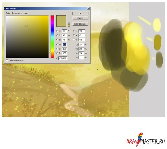
Step 3: Now you need to choose the main colors for your composition. And here are my colors for this illustration. As usual, I want to create a very bright drawing. For the background I chose yellow and blue shades. All other colors are for the environment. Open another file and save your colors. And keep this new file always open while you draw.

Click on the picture to view the image in full size and 100% quality.
Step 4: I decided to remove the old car that was parked near the house. She really doesn't fit here at all. This car doesn't fit with the rest of the picture. So I had to erase the car and paint an old oak tree instead, you might want to paint some other tree. I made a rough sketch in color with a large round hard brush, and then roughly painted in the details with the same brush but with a smaller diameter. I also created a new layer for the grass and did a rough sketch.

Step 5: I then started to paint in more detail on the green grass with a small hard round brush and a soft round brush to smooth out the image... but I may change this later, for example there might be some reddish blue or yellow flowers. But on this moment, I think green grass is just what you need.

Step 6: When I'm looking for a suitable color, I do this:
Step 7: Now pay attention to how I draw the wood. I don't show many types of wood in this tutorial. There are only two types presented here: one for the door, and the second for the fence.

Step 8: Now let me resize the canvas. As you can see, if you want to get a drawing with a lot of detail, then you will have to work on canvas big size(approximately 2000 or 2600 pixels).

Step 9: Add details using a small brush. Here, pay attention to how I draw the details of the roof.

Click on the picture to view the image in full size and 100% quality.
Step 10: In the next steps, I'm going to create some more layers for the green grass. The reason for creating multiple layers is that you will need to adjust the drawing later. It's much easier to correct mistakes if the main elements of your drawing are separate objects. I roughly colored the drawing using a large, hard round brush, and then added details with the same brush, but with a smaller diameter. I also created a new layer for the hair and did a rough sketch. Returning to the question of how to draw grass. Just click on the brush icon, select a different color and paint as shown in my sketches. Then just repeat the same action.

Step 11: Now it's time to start detailing the clouds. When drawing the clouds, I colored the shape white on separate layers, and then changed the layer's blending mode to Overlay so that the effect would be visible in the drawing. And I only used two layers for the clouds. One color is used as a base color, and the other color is used to increase the brightness of the background. Try to find a balance by combining different shapes brushes, and try to draw clouds using different strokes. You also need to define the light and shadows. Photographs of the real sky will help you in this matter. Just search Google for different cloud shapes.

Step 12: I also wanted to add some brightness sunlight and other details, such as a flash of lightning. After several attempts, I settled on the option shown in my drawing. It looked pretty rough at this stage, but I'll come back to that later. I should also note that each element of the design was on its own layer, which allowed me to quickly select the desired object and change colors with ease. Press Command+Click (on Mac) or Control+Click (on Windows) on the layer icon in the Layers palette to select the opacity.

Step 13: Settings. It is very important. You can pick up desired color and thereby change the entire atmosphere. Now I use Color Balance. After that I changed the brightness and contrast. You will notice how the lighting effect changes.

conclusions:
Now it's time to close Photoshop. I hope you enjoyed it! As a finishing touch, I add a Smart Sharpen filter to the flat drawing to get crisper, sharper lines. This helps bring out small details such as highlights. I hope you enjoyed reading this tutorial.

Click on the picture to view the image in full size and 100% quality.